I have recently red several articles describing accidents and lawsuits concerning Tesla car "autopilot" mode…

Can bad user experience make customers miss their credit card payments and create a lack of trust in their financial institution?
This post will highlight the need for better user experience design in banking portals, in order to achieve both business and user goals and advantages of paying bills on time.
As a curious reviewer of all things, I appreciate subtle changes and improvements in the tools I use. It is obvious to see which companies invest in thoughtful and user-centric design and it is often a pleasure to interact with those products even if they exist simply to pay the bills. But there are companies that operate for years without investment in improvement in user experience. If this is a product one can afford to abandon then the customer can move on to a better product. However, if there is a long-term commitment with a company, such as a bank or a creditor, it is not as clear-cut.
This is an example that will show the importance of user-centric design and proper interaction design in goal-oriented customer portals. Paying bills is already a chore but it shouldn’t turn into a nightmare.
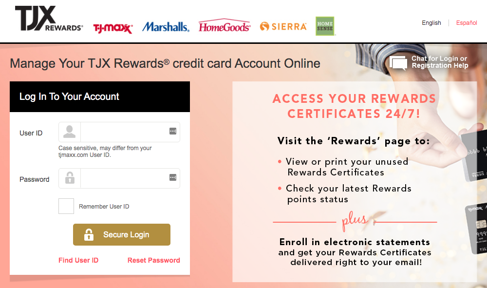
Personal story: I applied for a rewards credit card, in a store I shopped frequently. I will name the company because I think that it stands out as the most neglected user experience in the bill pay/banking sphere. TJX rewards credit card is managed by Synchrony bank. I am not sure which partner manages the development of the TJX portals. But there seems to be no evidence of user testing or even product usability testing.
After being approved at the store register, and making my first purchase with the newly opened account, I tried to establish online access. Because the card was not shipped yet, but the purchases were already made, I was eager to check on that account. But I was not able to. No matter what information I inputted from the receipt and my personal info, I kept getting error messages. Because I did not have time to call the bank, and I thought this will somehow get resolved, and I let this slide by. By the time I received the new card, I already had a late payment on my account. This was unlike any other bank I used.
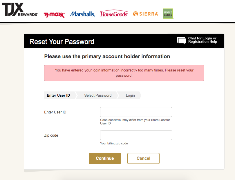
Eventually I was able to get into my account in the following months. But I could never log in. I was prompted to reset my password or use my card number. I started to feel like I must be crazy. How could I forget a password every-time? I felt very bad about this. On top of that, this bank does not just offer password reset, or two factor authentication. It always asked for the card number or worse, a partial social security number. So when I eventually misplaced my card for several months, because I stopped using it, I was unable to do anything on this online portal, including stopping automatic payments, when I lost my job. This card speedily racked up fees for overdrawing my checking account and the representatives were less than helpful in resolving anything. Months passed and I have stopped using the card altogether, fearful of the consequences, as I was not able to monitor this account with ease, or manually manage payments as needed.
The frustration recently escalated when I realized this online bank system is actually broken and nobody still cares to fix it. Recently I had to login several dozen times within a week to make some changes on the account and to add it to my budgeting app. What would take one login session turned into hours and days of attempts and resets. I counted 40-50 password resets in about a week. When my login attempts kept returning as invalid, and the budgeting app was not able to connect the account, i made sure I noted it down and yet, even this password failed. In reality, this bank login simply never goes through without resetting a password. I have reached out to the company and sent a ticket to some not very clearly tech issues email I found on the website, but there was no response.
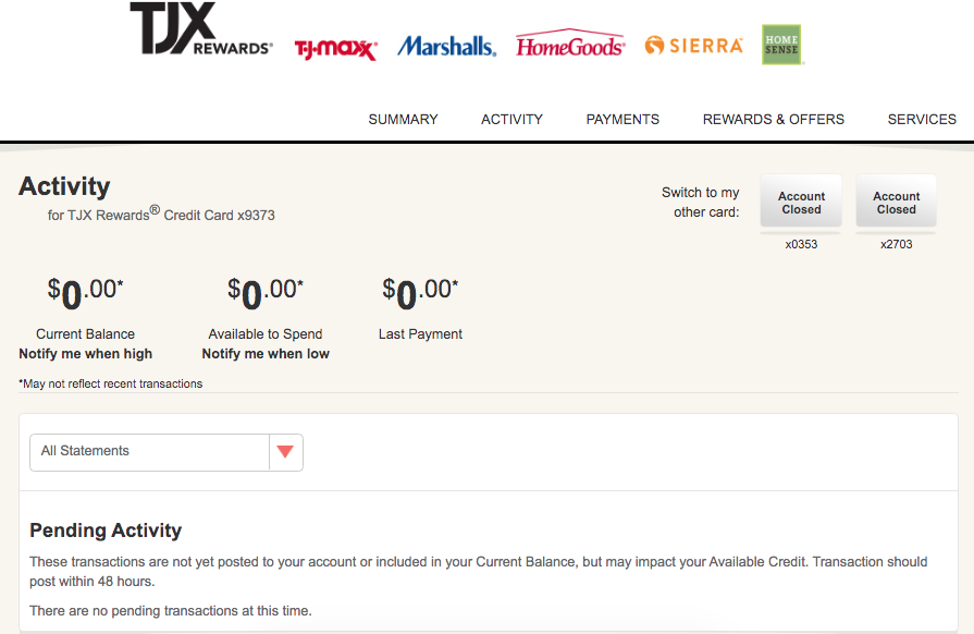
There are several issues with the portal besides not being able to login with a valid password. The user portal is not clear and far behind Capital bank or Chase with their big, bright buttons and useful toolbox appearance. When it returns an error, the language does not indicate whether the password or the user ID is incorrect. The message simply says: “that information does not match our system.” When one goes to reset password, there is no two factor authentication, or email link, it only asks for the card or for highly sensitive personal information. Which I am not comfortable offering 35 times a week. Also, this portal does not put any high security requirements on the password itself. Lastly when inside the portal, it is nearly impossible to find anything, like changing automatic payments, because there are no clear CTA buttons or clear language. Pages look empty and underdeveloped. Lastly the company itself is not responsive to any feedback and does not provide a clear way to reach out about technical issues.
After I realized I was not wrong with my attempts to login I felt quite angry because this has cost me actual money. I live most of my day online using different products and tools flawlessly, so calling in repeatedly to take care of basic account services, being on hold and encountering unfriendly credit card representatives is not a very contemporary way to do things. Most consumers will simply not call in if they can help it. It could be that bad online portal is truly a deterrent for paying your bills on time. These countless instances of ineffectual practices and lack of consideration for the user are shockingly inadequate in comparison to other digital products in 2020.
As a consumer and as a designer, I have never disliked a bank more. And I am one of probably countless consumers who keeps going through this. Of course the question arises, if consumers are charged late fees for inability to monitor their accounts in time because of this glitch, does the bank perhaps benefit in fees and interest? Could this be the dark side of UX?
As a consumer, would you trust a bank with a poor user portal and a lack of response to technical issues? Or would you try to move on to another bank?
Even though this experience did not benefit me as a consumer, I learned a valuable design and professional lesson. I know now more than ever that as a UX designer I want to benefit both sides of business, by creating usable, effective and inviting experiences that will not leave the users frustrated or questioning their own sanity and in turn create user loyalty to the business.


