The Challenge
The OwnBackup tech startup is rapidly growing and needs to present the pricing structure in an easily scannable and attractive format to potential customers. Originally there was a simple and long scrolling excell-like sheet so I took the initiative to research and suggest a new structure.
Project Background
Please visit the link below to view the live project.
CLIENT:
OwnBackup
ROLE:
External pricing pages analysis
Pricing page structure proposal
Collaboration with Dev Team
TOOLS:
Sketch
Illustrator
Photoshop
TIMEFRAME:
Four Weeks
Research
pricing pages by other vendors
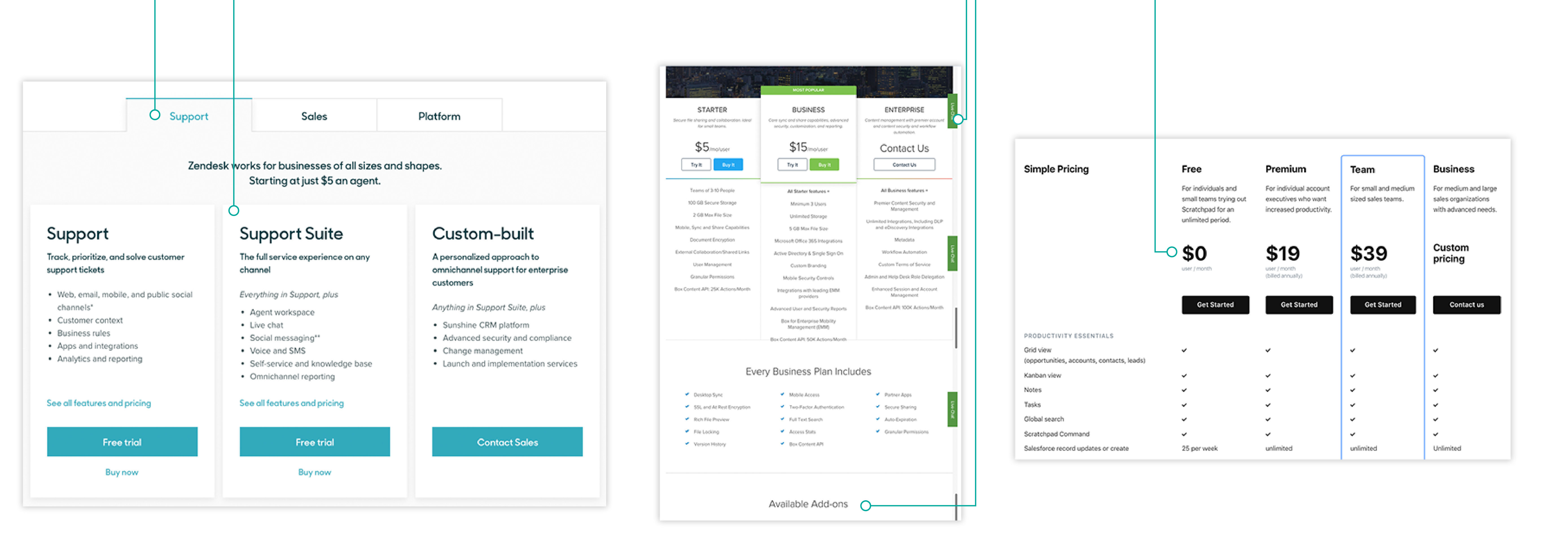
To determine what are some good pricing page design jumping-off points, I analyzed how other tech vendors structure their pricing pages. One thing was clear: pricing pages have a vast amount of information that needs to be organized to be useful. I have noticed the use of sizing and color hierarchy, tabs, highlighted fields, and columns, as well as collapsible additional information sections. Additional good practice was the use of the “Help” buttons to ask questions via chat. It is better to alleviate an apprehension than let it drive the user to another vendor.
1
Effective use of tabs to structure the tiers of service and cards can organize the information.
2
“Ask More” buttons help the decision process. Add Ons section for additional products.
3
Clear and large price points can help users to make an immediate decision based on their budget or needs.

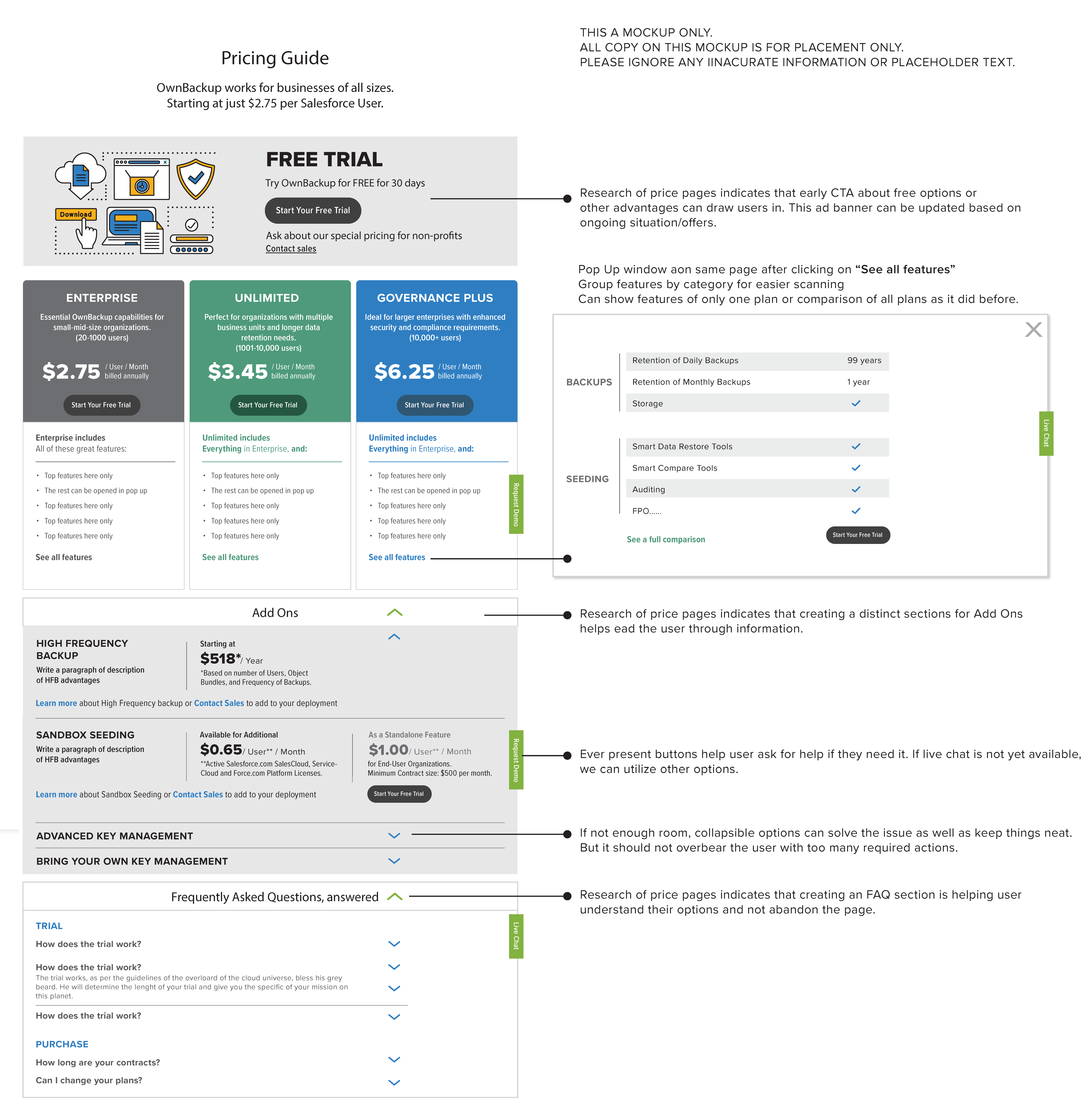
Recommended structure changes based on the pricing page analysis
This was an extremely fast turnaround to leverage the momentary interest of the leadership. Admittedly this is not a true mockup of a future page but rather a collection of observations and recommendations that were later refined to create the final design.

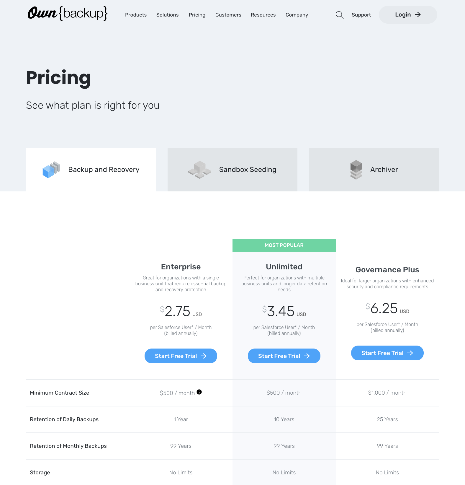
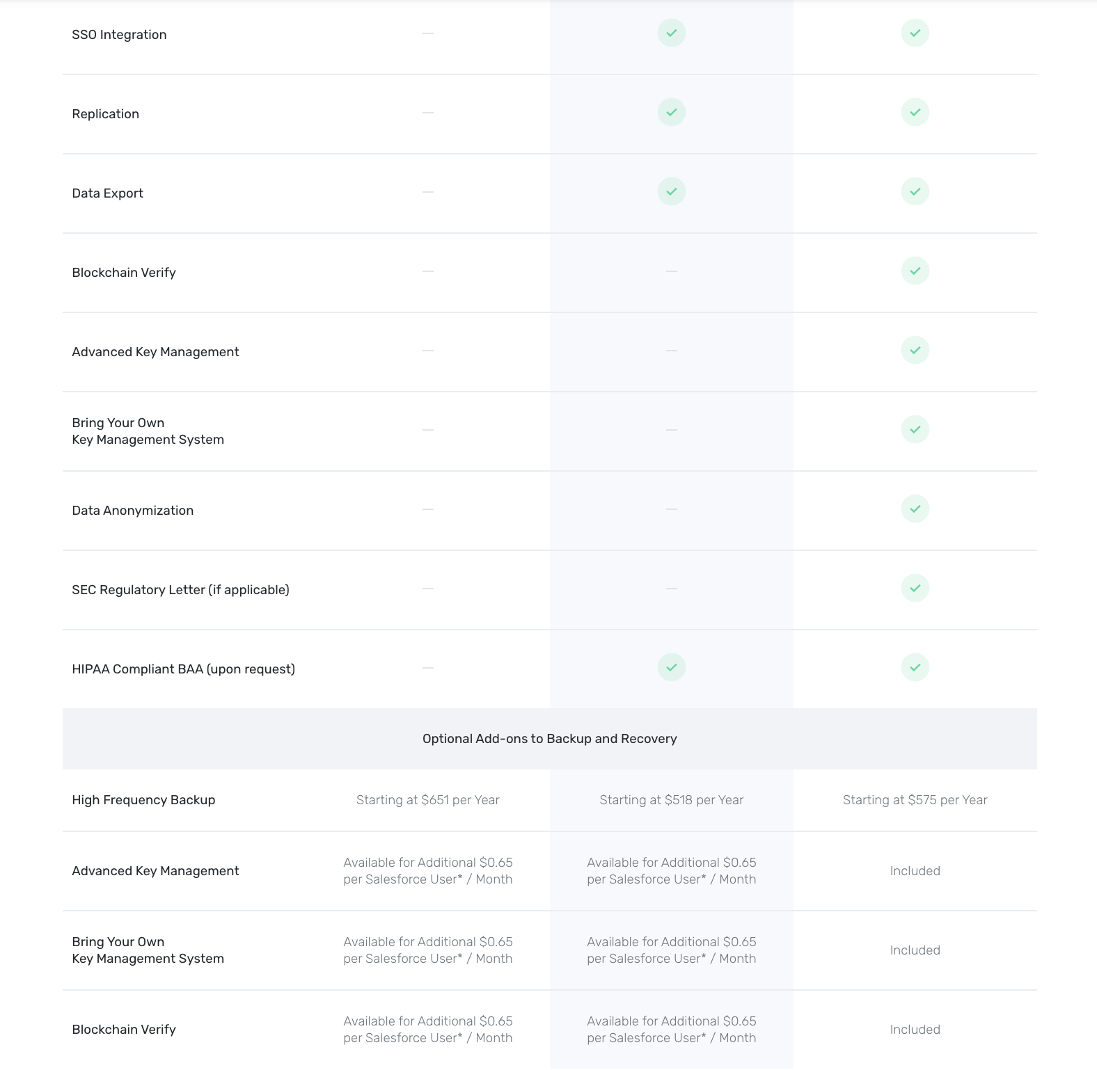
Final Design and Future Recommendations
A sticky header for the three product tiers would be helpful when users scroll down the page to compare features.
The typography in the left column of features should be more prominent and larger for easier legibility.
If there is a way to group the features into collapsible sections it may alleviate the long scroll.

